
Overview
Vinyl Mix is a concept iOS app meant to create connections between artists and audiences. The platform empowers users and DJs to explore, create, and share music. Check out my final designs next and how I got there. As the product designer, I was hired to solve a business case for a media startup that was transitioning from a freemium model to introducing a premium subscription for its iOS mobile app.
Role:
Product Designer
Problem:
How do I create the opportunity for new users to subscribe to the premium product during onboarding? Plus, introduce existing users to the new model without losing them?
Methods:
Low fi design, high-fi design, prototyping, secondary research, competitive analysis, journey mapping, research recruitment, cognitive walkthrough, wireframing, prototyping, usability testing and research analysis.
Timeline:
2 months
Platform:
iOS
The final Vinyl Mix solution

If you'd like to find out how I reached the final solution continue reading the full case study.
Vinyl Mix Persona
First, who are our users? They tend to skew 20's- mid 30's, are tech savvy and value independent music.

Secondary research
My discovery process was based on several factors. Since this is a fictional music app, I conducted secondary research to determine how other music apps introduced a premium subscription to new and existing users. Plus, look deeper into the IA.

Another important element of the business goal is allowing existing users to sign up for a premium account, so I needed to understand the information architecture of other apps.
User flows
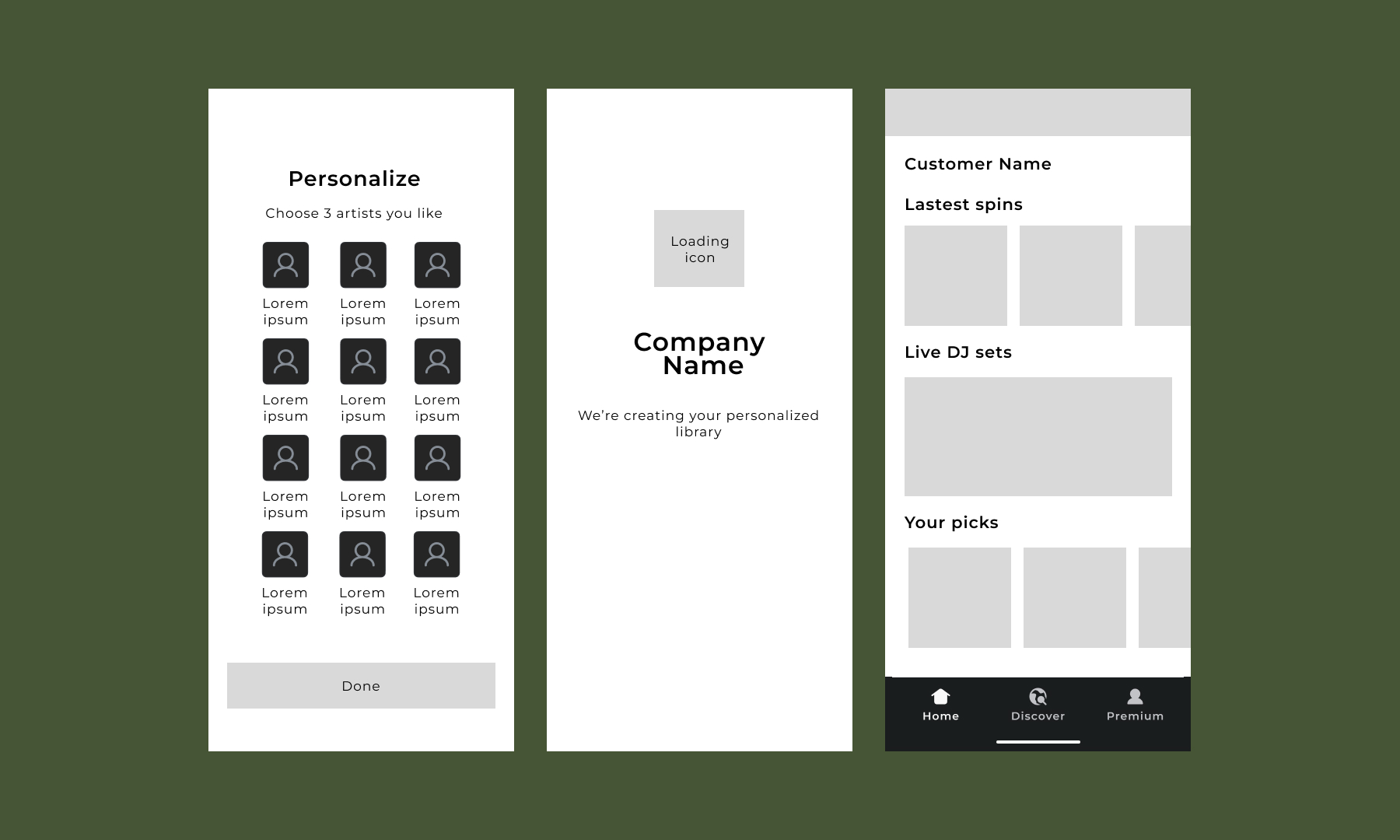
I sketched out the two main user journeys to test early ideas for solving the business problem before creating detailed designs. For new users signing up, my aim was to ensure easy navigation and clearly communicate the value of a premium subscription. In my research, I found that offering a free monthly trial is a valuable incentive, but it should only be presented after introducing the premium paid version. I also made sure to include the Apple Pay option for easy payment.

Wireframes

Returning users
For the important goal of encouraging returning free users to become paid subscribers, I wanted to ensure that the new offering wasn't intrusive. Since the product would be restricting key features behind a paywall, I didn't want to risk losing users. I decided to take a more subtle approach by changing the account name to "premium" to encourage user's interest.

Style guide
Before transitioning to high-fidelity frames, I created a style guide that included brand colors, logo, font, and components designed in the wireframe. I opted for a dark background color for the app to ensure that album covers and artist profile images would stand out, rather than blending in. The choice of secondary colors, green and brown, was inspired by nature and the popular YouTube channel My Analog Journal, as I aimed for the app to be bold yet calming.

High-fi screens and prototype
When creating high-fidelity screens, my primary aim was to maintain visual appeal without overwhelming the user with excessive content. Let's start with the new user onboarding flow. The following high-fi screens build on the low-fi screens and bring in branding.

With the main business goal of driving users to sign up for a premium subscription, I developed the new user onboarding process flow to offer users the choice to upgrade to a premium account. If they opt to remain on a free subscription, I provide a free month's trial. My approach aims to attract users who don't need a trial to subscribe to a premium account, capturing additional revenue.


Returning users
For returning users, I avoided using a pop-up to announce premium features. Instead, I changed the profile menu name to "premium" and used the profile image to pique interest in the change.

Usability test highlights
I conducted usability tests with five music-loving users, using two high-fidelity prototypes. Below are key highlights and my proposed solutions.
New Users:
- Issue 1: Users initially chose the non-premium option, then opted for the free trial.
- Solution 1: Updated the heading to "Use premium" for clarity and modified the premium copy to be more compelling.
Returning Users:
- Issue 1: The premium pop-up obstructed the home screen.
- Solution 1: Removed the pop-up after the initial test to avoid interruption.
- Issue 2: Returning users found the premium naming on the menu confusing.
- Solution 2: I changed the premium name to "Account" and introduced a banner for the premium offer with the option to close it.
Final updates and prototypes
Following the usability test, I made updates to my solution and addressed a few technical issues.
New user flow:
- I revamped the premium screen copy to showcase the perks of subscribing, aiming to prompt more immediate sign-ups without offering a free monthly trial.
- I updated the header to read, "Unlock the complete experience with premium" instead of "try premium."

Returning user flow:
- Instead of expecting users to discover the premium account, I reintroduced the concept of a pop-up on the home screen but reframed it as a way to inform returning users about the new subscription model.
- Additionally, I included an immediate offer for a free month of premium. This offers a sense of goodwill with existing users.

Learnings
- Introducing a new subscription model to an app that was once free requires careful communication and an attractive offer for existing users. It's a way to keep your current user base happy while also attracting premium users to the sales pipeline.
- When solving a product problem in an established market like music apps, studying the leaders in the space can provide a wealth of knowledge. It's a low-cost research method and can help businesses move faster in creating more revenue.
- In the realm of growth, there's a lot to be gained from usability tests. Small tweaks to the copy or changes in the flow can completely alter how a user reacts.

